


Jun 24, 2022; Denver, Colorado, United States; Colorado Avalanche fans raise a logo banner before game five of the 2022 Stanley Cup Final against the Tampa Bay Lightning at Ball Arena. Mandatory Credit: Mark J. Rebilas-USA TODAY Sports
The logo history of the Colorado Avalanche is quite interesting.
The Colorado Avalanche have had the same primary logo for their entire existence, and honestly there’s no reason to change it. The stylish ‘A’ with a snow flurry and a flying puck perfectly captures what the Avalanche are: A force of nature that leaves a huge impact in its path of chaos.
Except they do it on the hockey rink. But there is an interesting history if you look at everything else they’ve tried.
Let’s begin.

CALGARY, AB – NOVEMBER 11: Erik Johnson #6 of the Calgary Flames in action against the Colorado Avalanche during an NHL game at Scotiabank Saddledome on November 11, 2019 in Calgary, Alberta, Canada. (Photo by Derek Leung/Getty Images)
Cheesy, But Cool: The Colorado Avalanche “C”
The current patch the Avalanche wear is the Colorado ‘C’. A burgundy C with a black center and silver outline now graces the Avs’ current uniform. While it’s not as beloved as the Yeti Foot, fans still have a soft spot for the new patch. I know I do. An easy way to win the fans’ hearts is to show how much pride you have in the city/state you represent. Show them that this is truly your home. The Avalanche established themselves as a point of pride for the Mile High City from the moment they arrived. This is another way of showing it.
One fun way it’s been used is as the main crest at one point. During the 2015-16 season, the NHL held a Stadium Series. Outdoor games would be hosted by various venues across North America.
For a few teams, it would be two games: one featuring alumni from years past, and then a game between the current squads. In honor of the 20th anniversary of the iconic rivalry, the Avalanche and Red Wings were given a game. The alumni of the 90s teams played in a game, then the current squads faced off. In the second game, the Avs wore a white jersey featuring the ‘C’ logo.
This looks like a home run jersey. If you’re an Avalanche fan who loves repping their state pride, this is a beauty. Personally, I love the new patch. It may be little tame compared to the Yeti foot, but it helps represent the team’s namesake. It fits perfectly with the team’s current uniforms.

DENVER – SEPTEMBER 22: Adam Foote #52, captain of the Colorado Avalanche, stretches during warm up prior to facing the Los Angeles Kings during preseason NHL action at the Pepsi Center on September 22, 2010 in Denver, Colorado. The Kings defeated the Avalanche 4-2. (Photo by Doug Pensinger/Getty Images)
Fan Favorite: The Yeti Foot
A fan favorite staple of the Avalanche uniform for a long time was their Yeti foot patch. It was on the team’s uniform from their first season in 1995-96, until the 2016-17 season. While there’s yet to be any evidence of the Abominable Snowman residing in the Rocky Mountains, it fits in perfectly. Fans loved the idea of having a tangible mascot for the team.
An avalanche isn’t exactly an easy mascot to create into a costume. The original team mascot was a Yeti named Howler. From 2001-2009, Howler roamed the sections of the Pepsi Center.
The Yeti foot perfectly coincides with the team’s name. An Avalanche is a force of nature that moves swiftly with great power, leaving a major impact in its wake. The Abominable Snowman is a mythological figure of dominance and unseen strength. If there was any creature strong enough to rule Colorado’s mountains, it would be a Yeti. Fans loved the iconic patch and hope that it will make a return someday.
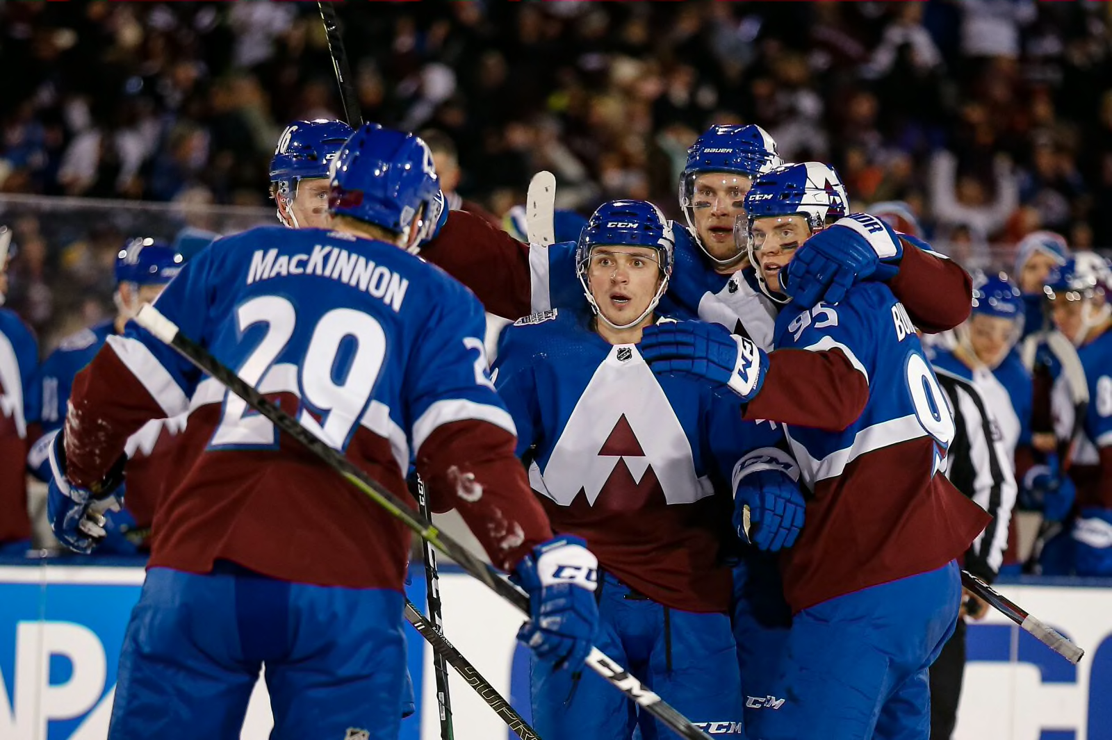
Feb 15, 2020; Colorado Springs, Colorado, United States; Colorado Avalanche defenseman Samuel Girard (49) celebrates with left wing Andre Burakovsky (95) and defenseman Erik Johnson (6) and right wing Mikko Rantanen (96) and center Nathan MacKinnon (29) after his goal in the second period against the Los Angeles Kings during a Stadium Series hockey game at US Air Force Academy Falcon Stadium. Mandatory Credit: Isaiah J. Downing-USA TODAY Sports
The Ugly Jersey of the Colorado Avalanche
This is one of the most unique ways the Avs’ have messed with their logo. During the 2019-20 season, the Avalanche were gifted a Stadium Series game against the Los Angeles Kings. On February 15th, 2020, the Air Force Academy in Colorado Springs hosted the outdoor spectacle. They went with a nice red, white, and blue blend.
This was the first hint at the blue pants and helmet that would soon follow. But the real highlight: the odd ‘A’ turned into a mountain. The idea makes perfect sense. The execution? Not so perfect.
The jagged parts below the main arch feel unneeded. It can be a little distracting, but that’s the only real drawback here. This is nice jersey otherwise, and something that is certainly unique in execution.
While it may be seen as ‘the ugly jersey’, I have a soft spot for it. The colors match perfectly and it’s a nice attempt to innovate the logo design. Fans may not love this jersey, but I certainly do.
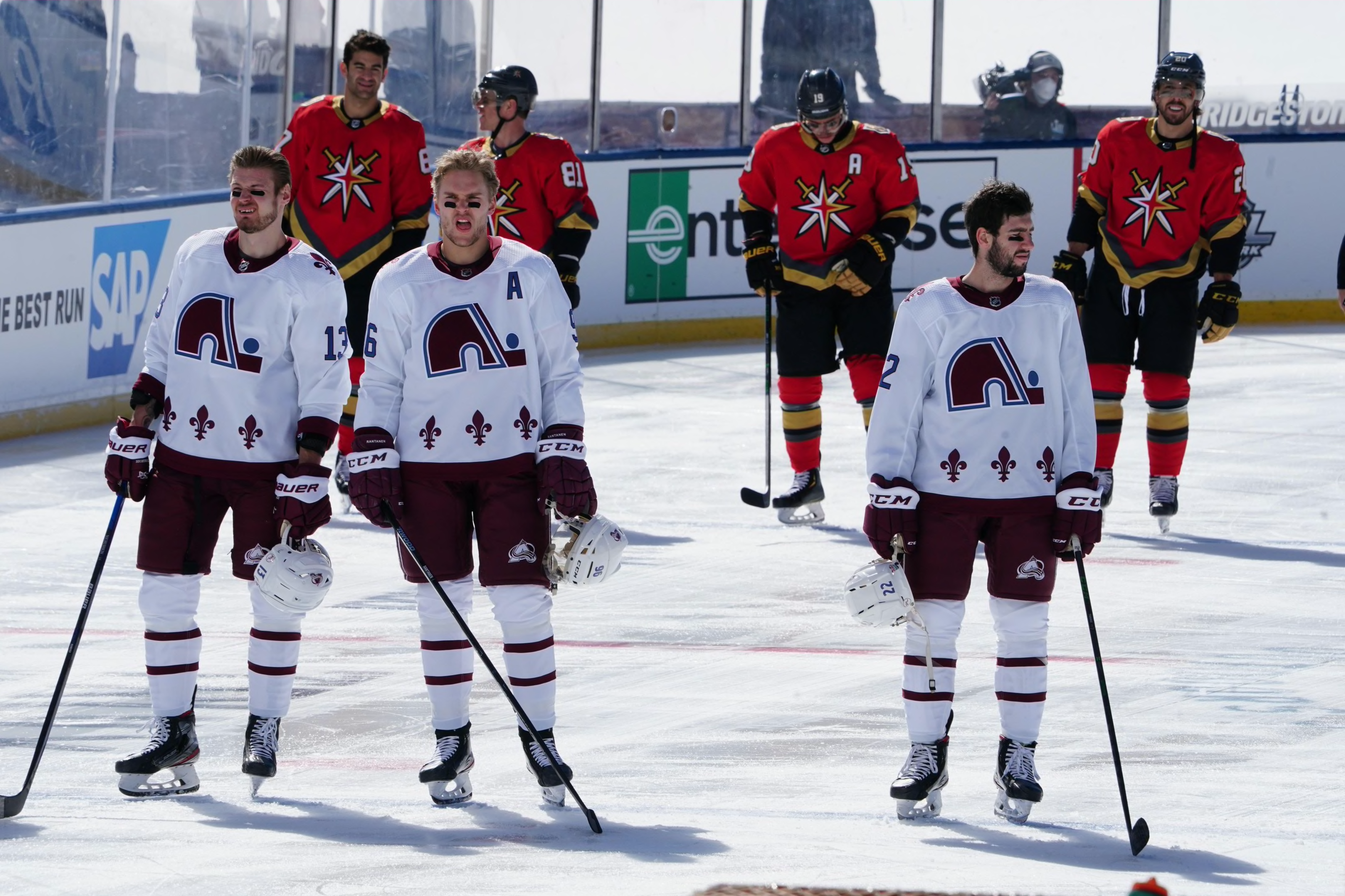
Feb 20, 2021; Stateline, NV, USA; Colorado Avalanche and Vegas Golden Knights players line up during the playing of the national anthem before an NHL Outdoors hockey game at Lake Tahoe. Mandatory Credit: Kirby Lee-USA TODAY Sports
Perfection: The Colorado Avalanche Reverse Retro
If you’re wondering why it took till now to address the Nordiques, it’s been for this. In 2020, the NHL had a genius idea: Reverse Retro jerseys and logos. Each team would get to select an old logo and uniform and put a spin on it. The Avalanche had, in my opinion, the best design. It looked its best during the Lake Tahoe Outdoor Game. On February 21st, 2021, the Colorado Avalanche and the Vegas Golden Knights played an unforgettable game. Each sporting their reverse retros, Colorado’s look made for an outdoor classic.
They went back to the Quebec Nordiques design but threw on the burgundy and blue. Best of all, they used the Nordiques logo. This was a no brainer and by far, one of the best jerseys the Avs have ever done.
The crisp, white jersey with the burgundy highlights all flow perfectly. It’s a perfect match of old and new. A homage to the Avs’ old home with the look of their modern scheme. It’s reported that the NHL will be doing another round of reverse retro uniforms for the 2022-23 season. Whatever Colorado does, it’ll be hard to top this gem.
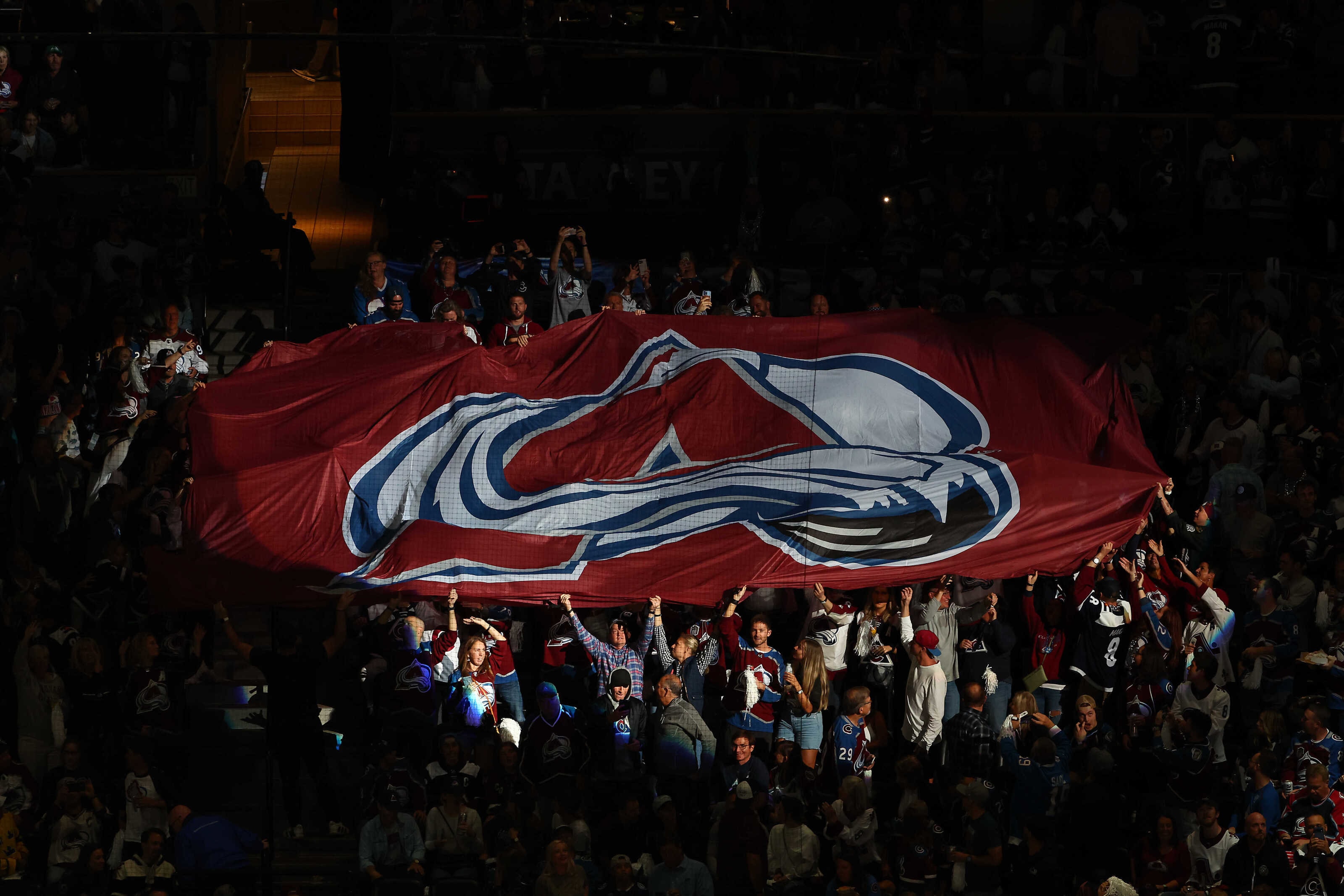
Jun 24, 2022; Denver, Colorado, United States; Colorado Avalanche fans raise a logo banner before game five of the 2022 Stanley Cup Final against the Tampa Bay Lightning at Ball Arena. Mandatory Credit: Mark J. Rebilas-USA TODAY Sports
If It Ain’t Broke, Don’t Fix It
Throughout the years, the Avalanche have mostly made small tweaks to their look. Their main uniform has only seen minor changes. The biggest changes have been the blue pants, helmets, and numbers, but it still looks great all these years later.
The logo should not change. At least not for a while. When fans see that logo, they associate it with dominant teams, fun superstars, and championships. The Avs will be raising a third Stanley Cup banner this upcoming season. Their logo will be on it, just like the others.
If it ain’t broke, why fix it?
Comments are closed.